


|
MARKETING Using A QR Code? Know 5 Essentials To Make Your Website Mobile-Friendly  (VOXtra) - A QR code is that graphic box you're seeing more and more of on marketing materials. When a mobile phone camera clicks on that box, the user jumps to the marketer's website. (VOXtra) - A QR code is that graphic box you're seeing more and more of on marketing materials. When a mobile phone camera clicks on that box, the user jumps to the marketer's website. 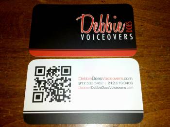 For instance, at right are two examples of that use by voice actors. And if you click the links below using a mobile device (as would happen by clicking the QR code) you reach a simplified mobile-friendly website. For instance, at right are two examples of that use by voice actors. And if you click the links below using a mobile device (as would happen by clicking the QR code) you reach a simplified mobile-friendly website.
By Jonathan Thaler Founder, When I'm Mobile There are several things that need to happen for a QR code to become an effective tool in the mobile experience. Of course, people have to understand what a QR is and how to scan codes. A reliable barcode reader needs to reside on their device, and the user needs to be comfortable using the technology. Most important - in my opinion - the scan needs to bring the user to mobile-friendly content that adds value to the experience. Merely providing a code to scan, without accounting for context or content, is a disservice to the mobile user and to the QR concept as a whole. MUST ADAPT CONTENT The campaigns presented thus far in the United States concentrate just on getting people to scan codes. Compelling, useful content seems to be secondary right now. Too many codes bring the user to sites that are virtually (or entirely!) unusable on their device. Most content-rich, computer-centric websites are full of large images, widgets, and Flash ads. Pages like this are easy to load and render on a computer with a high-speed connection but will probably load poorly on most mobile devices. Phones typically have smaller screens, slower connections, and browsers that are incapable of handling all the bells and whistles of a full-blown website. WHAT TO DO ... We have to start thinking about making mobile-friendly websites to enable QR codes. If you are thinking about using these for your voice over business, here are some design considerations for the QR-mobile interface: 1. Page Size: I make every effort to keep the page size for mobile versions of my websites to 200k or less, which accommodates most of the devices and carrier plans I have tested. 2. Image Size: This applies to both visual and file size considerations. You want your images to be small enough files to enable the smaller page sizes. You also need to have a good idea of screen sizes. Most smartphones can accommodate a width of around 300 pixels, but several models will need pictures to be around 175 pixels. You can create conditions in your code to change the size of the image depending on the device, or have multiple versions of the image to accommodate the different devices. 3. Essential Content: One trap that a lot of website owners and content providers fall into is the idea that the entire website should be on both the main and mobile versions. In many cases this can�t be done; in most cases it shouldn�t be done! The mobile user has different needs for information and content from those of the computer user. He/she is on the go, with not a lot of time to spend waiting for content to download and wading through irrelevant information, whereas the computer user sitting at home or in the cafe probably has more tolerance for this type of content and experience. As you design each page, ask yourself: "Is this content essential and relevant to the mobile user experience?� 4. Navigation Considerations: Typing on mobile phones is cumbersome, and typos are a fact of life. Limit the user�s need to type into data fields on a mobile webpage. If you are collecting bio info, a form requiring that information is a bad idea. A better solution: Ask for the email address. With that information, you can communicate with your users to get more information at another time, or when they are at a computer with access to the full-form version. 5. Experiment - Be Flexible: We are at the dawn of QR codes and smartphone technology. Keep an open mind, and continually absorb best practices as they become available. Experiment with different methods and presentations. We are very early in our exploration of the mobile Web user experience, and the opportunities to make discoveries and innovations are available to all of us. ABOUT JONATHAN ... New York-based Jonathan Thaler is the founder of When I�m Mobile, a company dedicated to helping clients push the boundaries of the mobile experience and performance. Email: jonathan@whenimmobile.com Web: www.whenimmobile.com |


.png)


Clicking the link on a smart phone DOES show us an entirely new site. Nice!
Debbie's and Cecil's sites are set up to bring up a special mobile-friendly version on your phone, which is different from the site you see on your computer when clicking the same link. While you may have differences of opinion with the artists in terms of their web design considerations, the problem I solve is that websites need to present and work as well, and actually better, on the phone than they do on computer or laptop. Please view cecilvoice.com and debbiedoesvoiceovers.com on your mobile device of choice to see the concept in action.